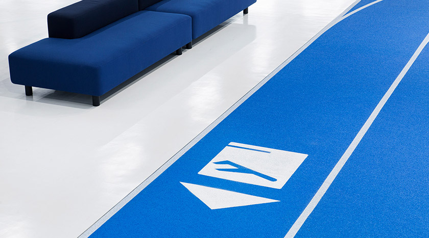
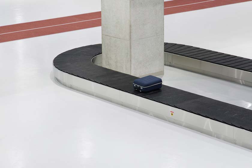
With functionality and economical design in mind, the Narita International Airport Terminal 3 in Japan has opted to use running tracks instead of the conventional moving walkways and illuminated signs.
Due to the terminal being designated for low-cost carriers thus having a limited construction budget, architecture firm Nikken Sekkei in collaboration with creative lab Party have designed and constructed a low-cost, minimalist and refreshing environment for the travellers visiting the airport terminal.
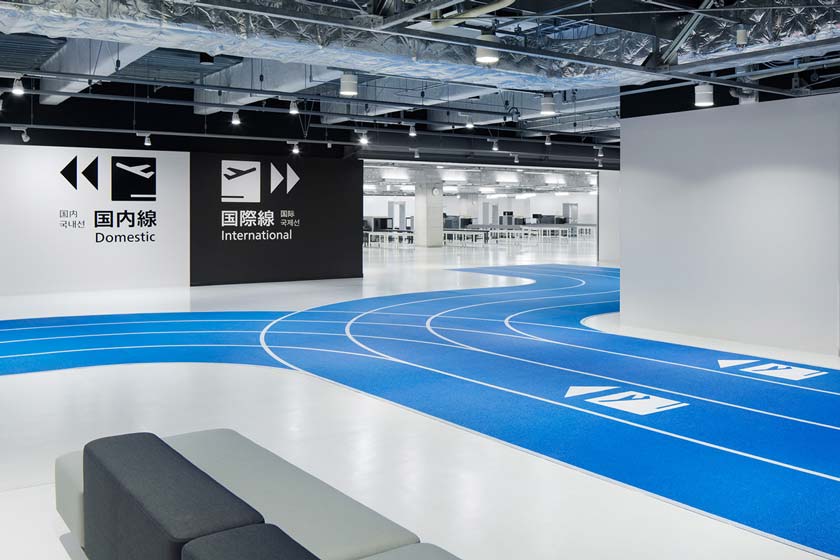
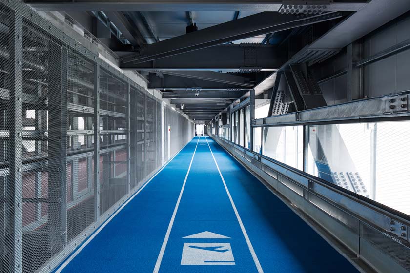
With blue tracks signifying departure, the colour blue is said to be chosen because is the colour of the sky and instills the forthcoming feeling of travelling to far destinations.
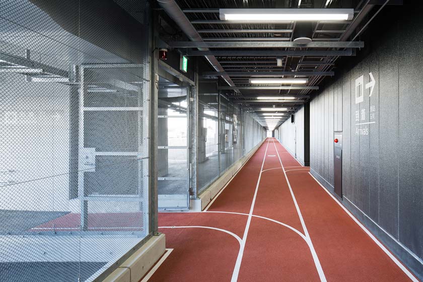
The earth red signifying arrival is said to be chosen as it represents “the sense of relief when people finally land in Japan after a journey.”

With the two colours implemented on the tracks, the designer’s intention is to easily and effectively guide travellers in and around the terminal.
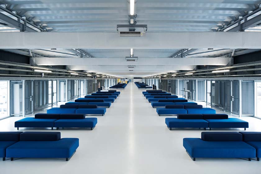
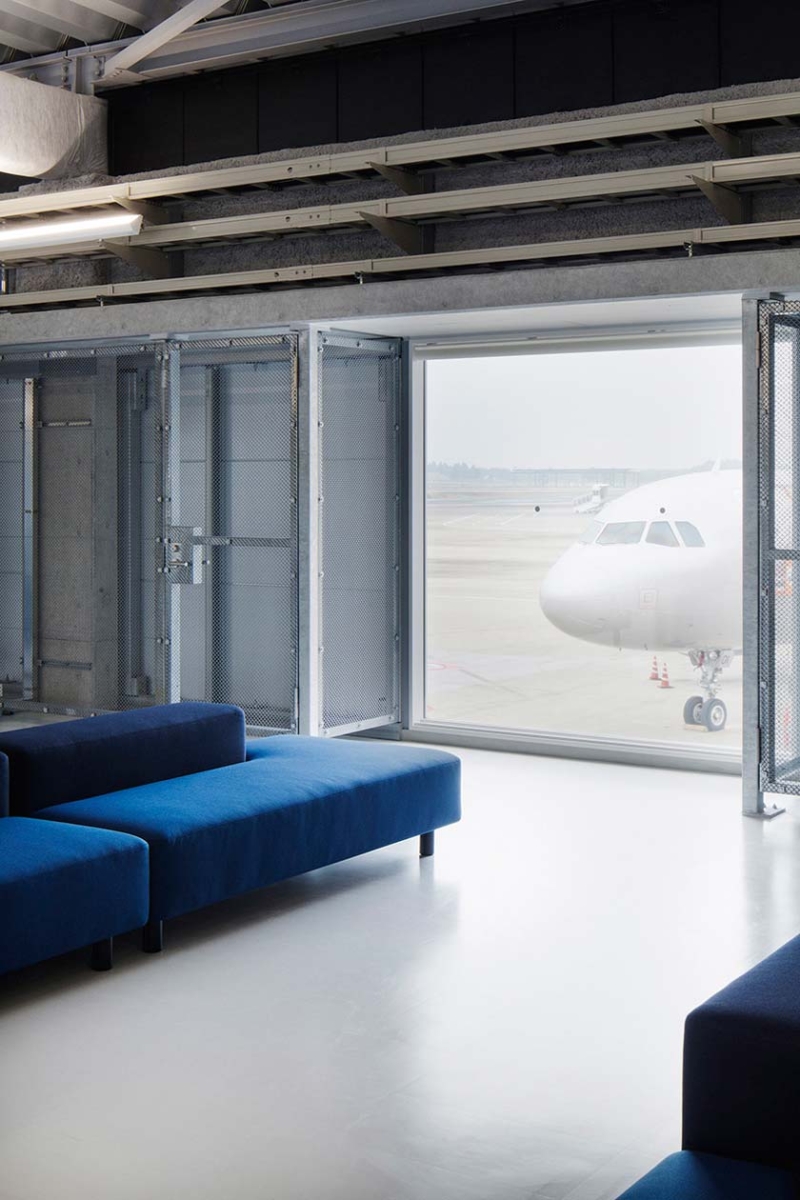
The terminal also uses custom-made furniture such as sofas, tables and chairs from a Japanese retail company called MUJI.
To learn more about Terminal 3, click the link below.


