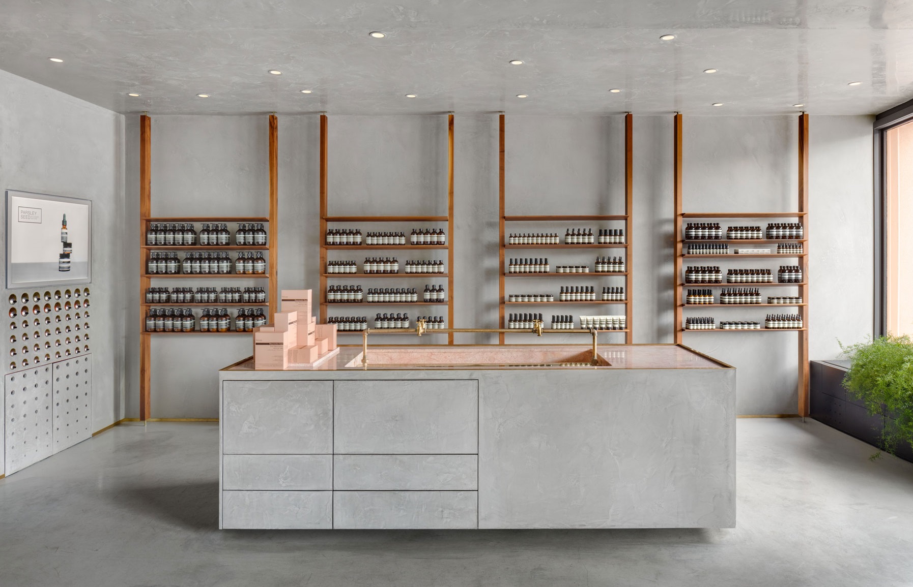
Designed by Montréal-based architecture firm _naturehumaine, Aesop‘s store in the Kitsilano neighbourhood is inspired by the coast and mountains of Vancouver, British Columbia.
The store façade is painted in rose pink, reflecting the local Craftsman-style residences that are clad with light wood or plaster in pastel tones.
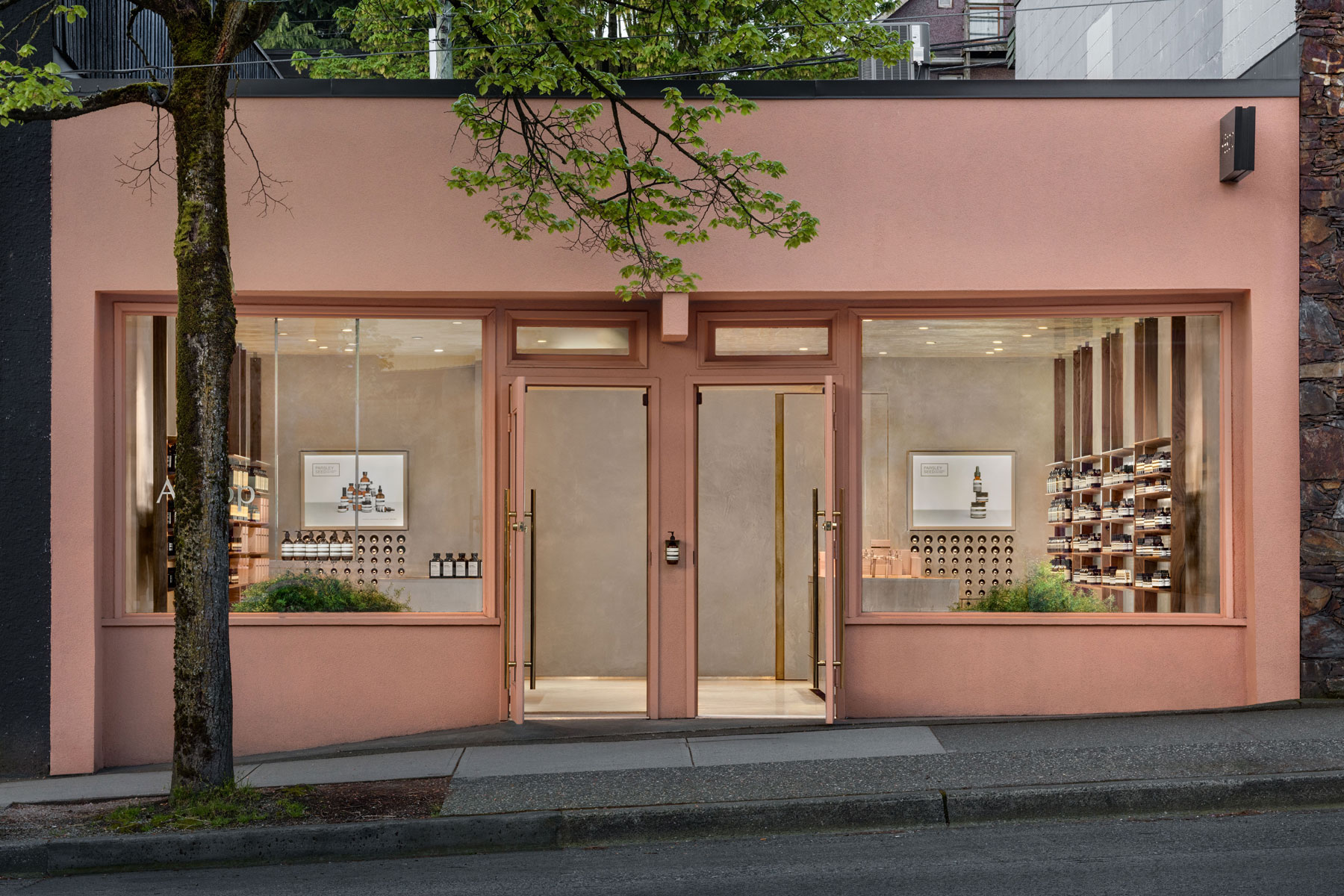
Referencing how Vancouver is a coastal city that is build on a plateau that overlooks the surrounding mountains, _naturehumaine says that the store transcribes the geological elements by being composed of certain materials that allow for the raw minerality of mountains and water to meet.
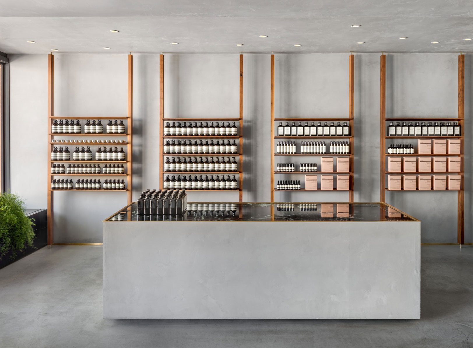

To express the duality, the store is divided into two where the left side is finished with a matt mineral-grey plaster while the right side is more lustrous, emulating the reflective quality of water.
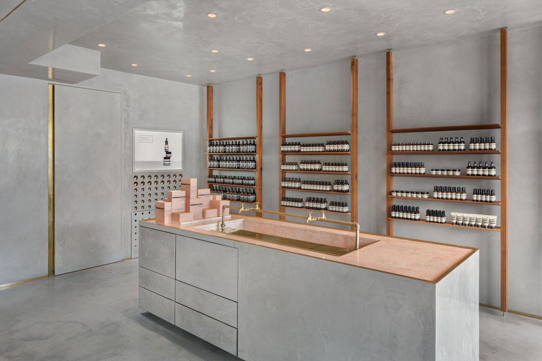
Further reinforcing the theme of yin and yang are the opposing demonstration sink and point of sale that feature different counter colours to one another.
Along the walls are vertical grids made from walnut wood that shelve Aesop’s products.


