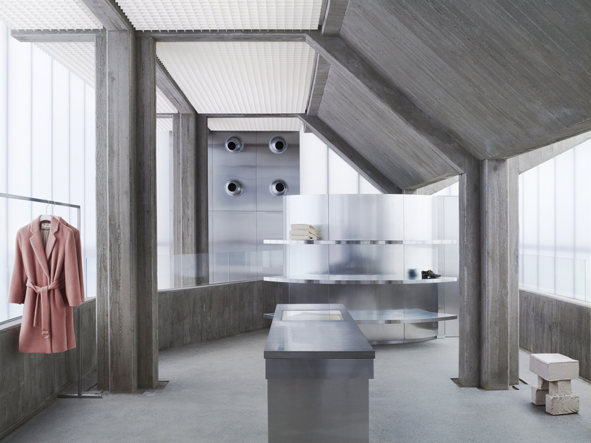
Situated among the modern, upscale streets of Gangnam-gu, Seoul, Acne Studios‘ flagship store designed by Sophie Hicks Architects stands boldly as a feat of architecture that is “forceful and exude attitude”.
“Seoul has a highly distinctive character,” explained British architect Sophie Hicks. “The large number of western brands to which it is home – powerful brands, with strong identities – could very easily have undermined its individuality; but this doesn’t seem to have happened. As a visitor, my impression is that western brands and Korean urban culture have given something to one another; that they have cross-fertilised to exciting effect.”
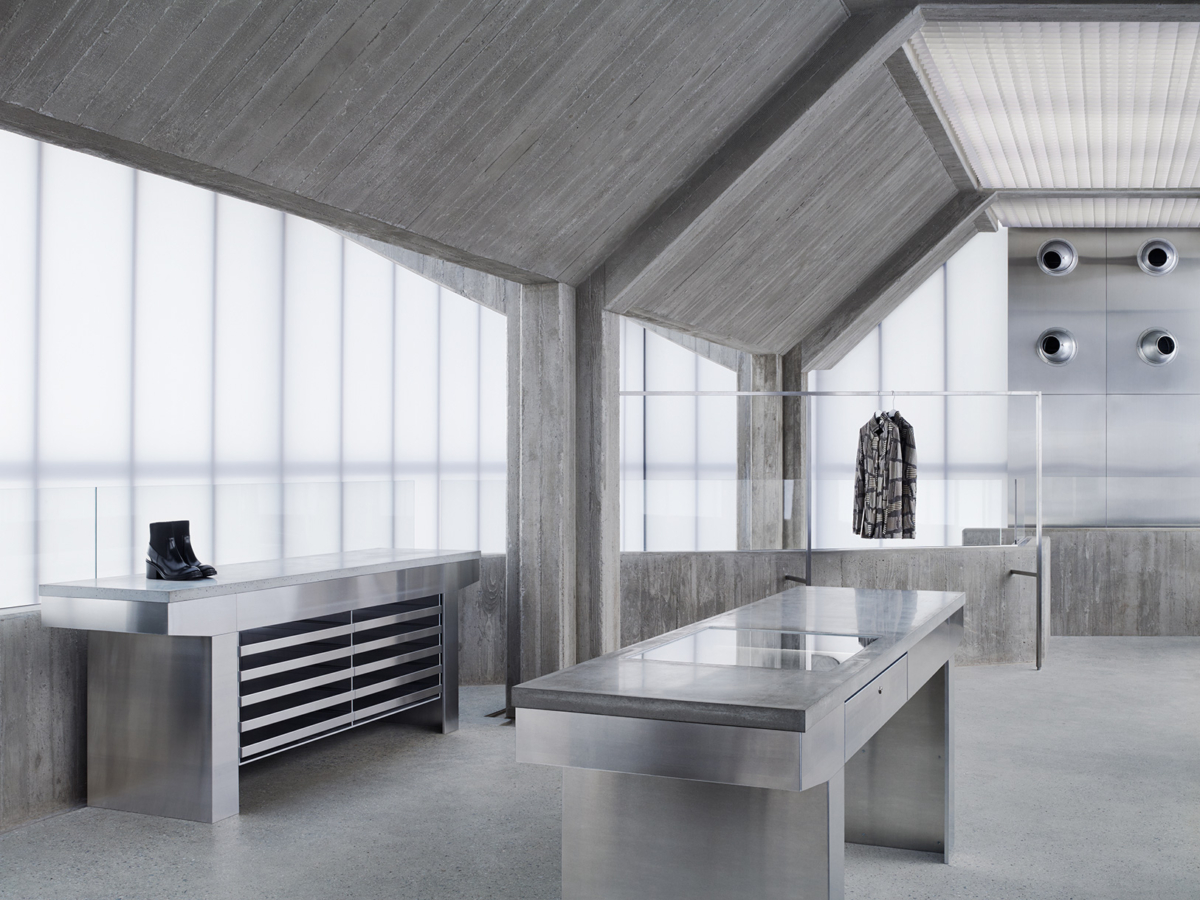
“With our architect Sophie Hicks in London, our partner Shinsegae in Seoul and our HQ in Stockholm, it certainly has not been an easy process to build this house together from scratch. That said, I think we are all very proud and excited about the result,” said Mikael Schiller, chairman of Acne Studios. “The standalone building plays with the contrast between modest discretion and forceful attitude.”
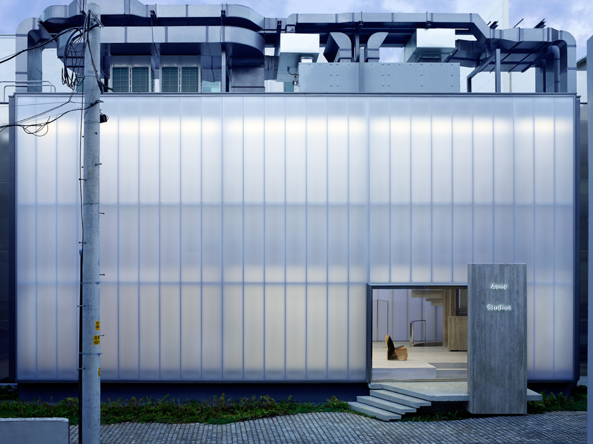
The exterior is essentially one large lightbox that is described by Hicks as being “translucent and ghostly but, in essence, plain and simple”.
“Appearances, though, can be deceptive; and so they are, in this case. As soon as you enter, you realise that while it may only be a box, it is a box concealing a heavy, brooding, concrete monster,” said Hicks.
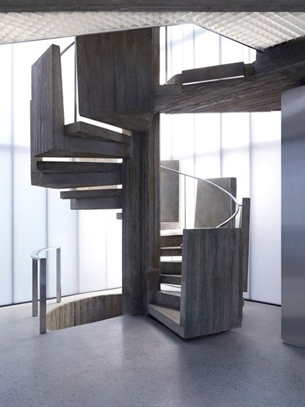
With two floors in total, the rectangular building is supported by four pairs of concrete columns. There is a spiralling staircase around a column.
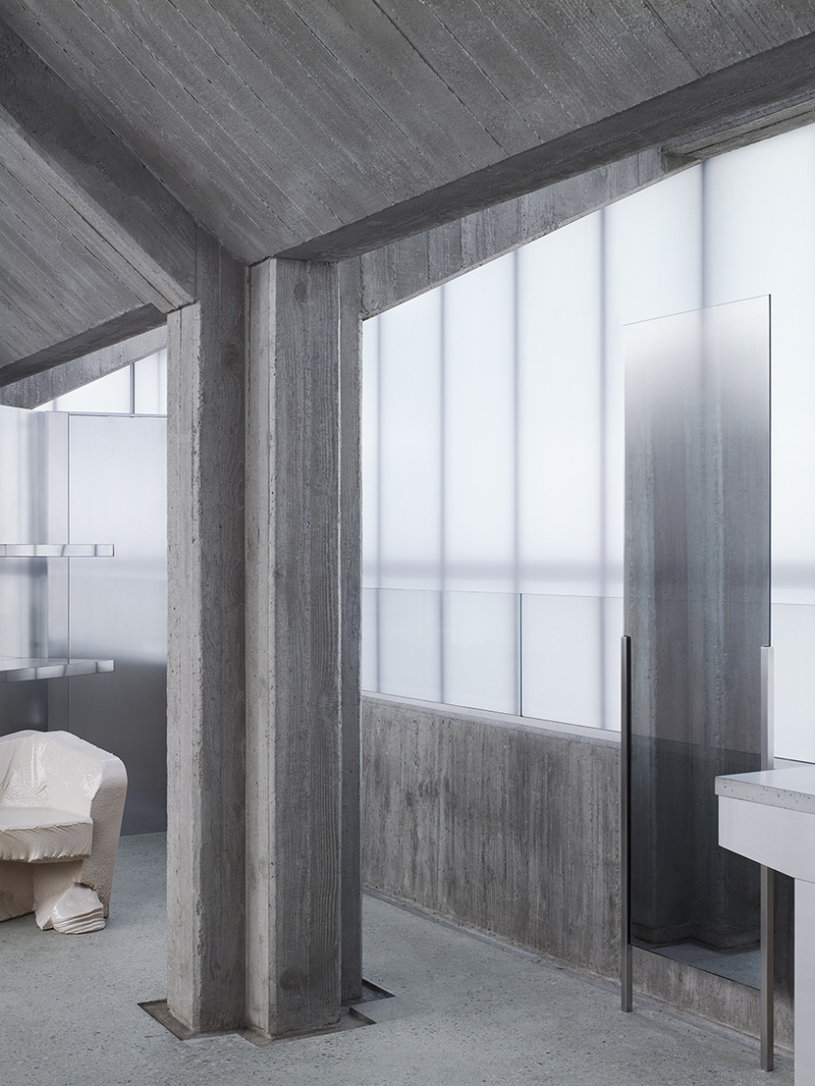
The store features no decorative finishes, allowing Acne Studios; garments to be presented against the concrete and metal surfaces.
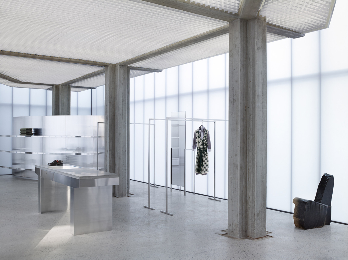
As a means of completely reducing the number of disturbances, no ducts or pipes are visible in the interior of the store.
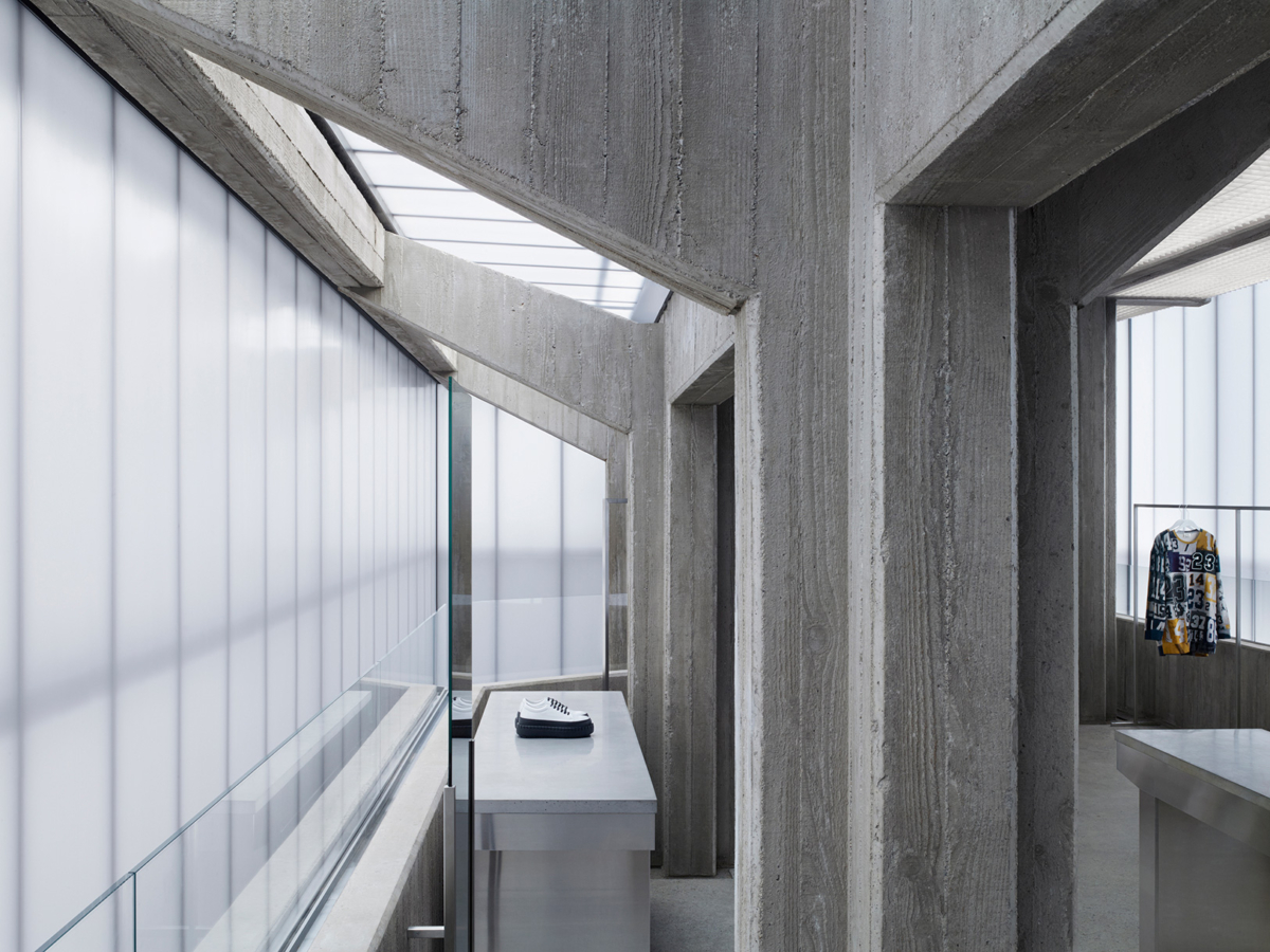
“Sweden is a land of light and air: vibrant light and clean, fresh, invigorating air that can induce feelings of euphoria and otherworldliness,” noted Hicks. “The shop’s atmosphere is otherworldly. You are cut off from views of Seoul; you are enveloped in soft daylight, filtering through the polycarbonate walls, and light from bare fluorescents overhead, diffused by metal grids; and we have played tricks with the music to increase the sense of otherworldliness.”


